In my column last week at The Breakthrough Institute on Robert Gordon's analysis of US per capita economic growth, I identified what I believe to be an error in his calculation of post-1950 growth rates. Such an error matters because Gordon's recent discussion paper has been called “the summer’s most talked about working paper in economics” and argues a data-based case for US decline. My view is that such discussions should at least start with a solid empirical basis and re-checking assertions grounded in data claims is fair game (not all agree, however).
Gordon has written the following to explain his main graph, which appears just below:
"Each of the successive periods after 1950 exhibits a downward step in per-capita real GDP growth, with steps downward marked at 1964, 1972, and 1987."

1928 to 1950 - 2.4%These numbers do not show successive downward steps in US GDP per capita growth rates from 1950. In fact, the peak is right in the middle of the periods, and otherwise the growth rates are very similar through the period. The calculation of trends on the time series is very sensitive to the start and end point chosen for analysis -- which should raise a red flag for chartist-based arguments.
1950 to 1964 - 2.1%
1964 to 1972 - 2.9%
1972 to 1987 - 2.1%
1987 to 2006 - 1.9%
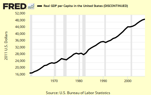
This discrepancy between our analyses of the data explains why the linear trend I calculate from 1950 to 2006 shows a tiny decrease, essentially no decline, contrary to his sharp decline graphed in red in the figure above. The graph at the top of this post shows data from FRED from 1960 (start of that dataset) on US per capita GDP (plotted on a log scale). Similarly, it shows no evidence of any stair-step decline in growth rates, certainly not a decrease by half illustrated in Gordon's graph.
I have invited Gordon to address the discrepancy in our datasets and help me to identify where I have made a mistake or perhaps if his data is in error. Readers are welcomed to chime in.
UPDATE: In the original graph posted at The Breakthrough Institute I showed ten-year growth rates for the Maddison dataset rather than the annual values as stated in the graph title. The annual values are shown below. There are no implications for the analysis -- the data is the same. Sorry for the error.
