UPDATE:
I think I have figured it out.
1. The Figure above does not appear in Muir-Wood.
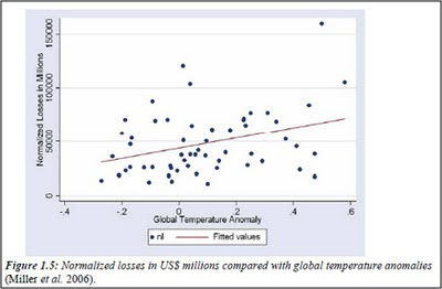
2. A different figure, 1.5 from the SOD, was criticized by reviewers. Figure 1.5 was a scatter plot of temperature anomaly and normalized damage 1950-2005, shown below.

3. In response, the IPCC instead chose to make its own Figure SM 1-1 above at the top of this post, which plotted only 1970-2005 and smoothed the data.
4. The original Figure 1.5 from the SOD is ultimately included in the published version of Muir-Wood et al. in 2008, exactly as it appeared in the SOD, with this explanation:
Without fully controlling for other factors that could affect the trend in losses, we can not draw any firm conclusions about the role of climate change in loss trends. In addition, any conclusions about a relationship between global warming and disaster losses are complicated by the sensitivity of statistical results to a few high-loss data points, the short historical loss record, and the limitations of the normalization methodology.
Hypothesis: The IPCC created a graph that did not exist in the peer reviewed literature or in the grey literature to suggest a relationship between increasing temperatures and rising disaster costs.
END UPDATE
In the comments Ian does some brilliant detective work to locate the origins of the above mysterious and misleading graph from the IPCC AR4 WGII Chapter 1.
I spent some time parsing through the FOD, SOD and related comments for this portion of Chapter 1 of the WGII report.
The graph that Hu McCulloch asks about, and which Roger criticizes above, initially appeared as part of the text in the SOD as figure 1.5. It was a scatter graph, with a “Fitted Values” trend line drawn in. At that point, the source was being cited as “Miller et al. 2006” rather than Muir-Wood; I assume, however, that it is the same source (the full reference was: “Miller, S., R. Muir-Wood, et al. 2006: Weather related catastrophe loss trends and the impact of climate change,. In lit. (to be circulated prior to publication).”) (See p. 91 of Ch. 1 of the SOD) [PIELKE COMMENT: YES]
The use of the “Miller” paper drew a number of comments from the expert reviewers. One of those experts was Annick Douguedroit of University de Provence, who commented (http://ipcc-wg2.gov/AR4/SOD_COMMS/Ch01_SOD_Expert.pdf at p. 122)
“Fig 1,5 is not reliable from a statistical point of view because the significant trend is pulled upward by "outliers" (especially 3 points with losses >100000 ) which provoque a pseudo-significancy as it is suggested by the authors themselves in lines 18-21 [of the SOD] "Removing......entirely". So I propose "Since 1970 the global normalized results do not show any statically significant correlationn with global temperatures." and to remove the end of the paragraph and the figure 1,5 because it can mislead a reader not familiar with correlation."
The response from the “Writing Team” was:
“Figure moved to Supplementary Figure and employed a different plot that smoothes catastrophe losses and shows these alongside temperature. After smoothing (that thereby removes the peaks noted) the correlation remains. The text now provides a balanced commentary on this.”
So, it is clear that the graph seen in the supplementary materials to Chapter 1 of WGII, was the creation of “Writing Team”. Perhaps Roger can answer whether the original graph (as shown in the SOD) was the work of Muir-Wood. [PIELKE RESPONSE: SEE UPDATE ABOVE. I FIGURED IT OUT.]
Concerns were also raised by Indur Goklany (US Dept of the Interior), Francis Zwiers (Can. Centre for Climate Modelling and Analysis) and Nathan Gillet (University of East Anglia).
Zwiers commented (pp. 121-22):
“I’m wondering if too much space is devoted to Miller, given the inference one draws from Fig 1.5 is senstive to the inclusion of individual outliers (as pointed out in the text) and that it is acknowledged that early data are incomplete. Some additional comment on data quality, beyond just completeness, is probably in order (I'm not expert, but this type of data would presumably be influenced by all kinds of factors, including varying political influences and changes in reporting practices, that might confound any climate signal)."
To which the response was:
“Agreed – will restate the conclusions of this work judiciously to summarize what is revealed and what is uncertain.”
Gillett was concerned about the statistical underpinnings (p. 122):
“Is the statistically significant correlation purely a result of the trend in both series? Does the correlation remain statistically significant if both are de-trended? If not, then this merely tells us that both series contain a trend. More fundamentally, why correlate losses with global temperature? Some justification is needed.”
To this, the Writing Team responded:
“Losses can be correlated with year and also with global temperatures. The correlation with T is a function of both series containing trends with time over this period.”
I’ll leave it to the stats types to argue over whether the answer was actually responsive.

