28 April 2015

Earthquakes: Death Rates and Frequency of Big Events

The earthquake disaster in Nepal continues to unfold, now with more than 5,000 confirmed deaths, a number that is sure to rise.  Several excellent pieces on earthquakes (such as these by Brad Plumer at Vox and Andy Revkin at the NYT) have me thinking about long-term trends. So I have quickly put together some data, with some interesting results.

1. Are we, globally, doing better with respect to earthquakes?

The graph above shows data for 1900 through 2014 on global death rates, expressed as deaths per million global population. (Data: Our World in Data, Daniell et al. 2011 through 2010 with population estimated through 2014 and earthquake fatalities updated for 2012, 2013, 2014).

Since 1900 earthquake death rates have dropped by more than 80% (based on a linear trend, shown in red). This is extremely good news, and is suggestive that even as global population increased by a factor of more than 4, we collectively are doing much better with respect to earthquakes.

But let's zoom in to the most recent 25 years and take a closer look.
Since 1990, death rates have increased by a factor of about 3, based on a linear trend (red). What exactly  is going on here?

The answer appears to lie in a recent increase in the occurrence of large earthquakes, which I address next.

2. Have earthquakes become more common? 

The graph above comes from my colleague here at CU-Boulder, Professor Roger Bilham, a world authority on earthquakes and central Asia in particular (Here is Bilham on the Nepal quake). That figure clearly shows a big gap in the incidence of magnitude 8.4 quakes and greater from the mid-1960s through the early 2000s. The swarm of big events in the 2000s coincides with the increased death rates over the same period shown above.

The pattern also shows up at slightly lower earthquake intensities. The figure below shows that same 1980s and 1990s "lull." The result is a pattern of an increasing incidence of strong quakes since 1990 which also shows up at magnitudes 8.0 and 7.5 (from Ben-Naim et al. 2013).
Another study concluded, "Obvious increases in the global rate of large (M ≥ 7.0) earthquakes happened after 1992, 2010, and especially during the first quarter of 2014" (here in PDF). So it seems clear that the world is in a recent period of increased earthquake activity. But does that mean that earthquakes are increasing? Or is it that we are having a run of bad luck?

The figure immediately above, showing long-term incidence back to 1900, provides a good sense of where experts presently are on these questions.  Here are conclusions from three recent papers that looked at these questions:
  • Parsons and Geist 2014 (PDF): "we cannot find a strong signal associated with global M ≥ 7.0 earthquakes that rises above the random fluctuations that are observed between regular 48 h periods; the largest rate increases we see are not associated with global main shock."
  • Ben-Naim et al. 2013: "in the magnitude threshold range 7.0≤Mmin≤8.3 which constitutes the vast majority of great earthquakes on record, the earthquake sequence does not exhibit significant deviations from a random set of events." (They do note the two clusters of >8.3 events, one mid-20th century and one during the past decade.)
  • Shearer and Stark (2012): "Global clustering of large earthquakes is not statistically significant: The data are statistically consistent with the hypothesis that these events arise from a homogeneous Poisson process."
None of the studies listed above rule the the possibility that earthquakes are becoming more common, they simply find no evidence to support such an assertion, given the historical occurrence of events (compare Dimer de Oliveira 2012). This has to do with both statistics (no evidence of a long-term trend) but also physics (no reason to expect such an increase beyond variability).

That is the science. But from a practical perspective, large earthquakes clearly have become more common since the 1990s. This is also reflected in death rates, which overall have improved since 1900, but at least some part of that improvement is an artifact of infrequent large earthquakes in the 1980s and 1990s.

The Bottom Line

The world is doing better overall with respect to earthquakes. But some of that improvement is based on some good fortune of the 1980s and 1990s. For whatever reason -- and the current consensus is just a random uptick in a variable geophysical process - strong earthquakes have become more common over the recent decade than they were in the two decades before that.

The recent devastation should provide a reminder that we still have a lot of work to do to reduce vulnerability to earthquakes. We can't control where, where or how strong, but we can exert a huge influence on the death and destruction that results.

27 April 2015

The "Sweet FA Prediction Model" and The UK General Election

[Warning: Electoral outcome spoilers ahead.]

The UK has a big election coming up. Here I'll be evaluating some of the pre-election predictions after the results come in. But it turns out, that may be a futile exercise, as it appears that the results are already in. Congratulations are in order for Ed Miliband, the next PM of the United Kingdom.

Let me explain.

Back in 2000, Roger Mortimore, director of political analysis for Ipsos MORI, discovered a remarkable predictive relationship for the outcome of UK general elections.

Elec.WinnerFA Cup holders (year of final)Shirt colour(s)Correct?
1997LabManchester U. (1996)REDY
1992ConTottenham H. (1991)WHITEY
1987ConCoventry City (1987)Sky BLUEY
1983ConManchester U. (1983)REDN*
1979ConIpswich Town (1978)BLUEY
O'74LabLiverpool (1974)REDY
F'74HungSunderland (1973)RED and WHITEY
1970ConChelsea (1970)BLUEY
1966LabLiverpool (1965)REDY
1964LabWest Ham U. (1964)RED ("Claret")Y
1959ConNott'm Forest (1959)REDN
1955ConNewcastle U. (1955)Black and WHITEY
1951ConNewcastle U. (1951)Black and WHITEY
1950LabWolves (1949)YELLOWY
* Would have been correct if Brighton & Hove Albion (BLUE) had not missed an open goal in the dying seconds of the FA Cup final, before losing the replay.
Mortimore explained:
All you have to do to predict which of the major parties will have an overall majority in the Commons following the election is to note the shirt colours usually worn by the current holders (on election day) of the FA Cup. If their shirts are predominantly in the Conservative colours of blue or white, a Conservative victory will ensue; on the other hand if the predominant colour is red or yellow, Labour will be successful. (Black stripes are ignored.)

The table shows that the Tories win an election held when the FA Cup is held by a club who play in predominantly Blue or White shirts; Labour wins when the cup holders wear a shade of Red or Yellow. A hung Parliament results when the Cup holders wear both parties' colours.
The FA Cup holders for the 2015 general election are Arsenal (as it should be, but I digress), who wear red, and sometimes yellow. This implies a Labor victory and thus Ed Miliband as Prime Minister.

Now, to those skeptics of the "Sweet FA Prediction model" (as Mortimore calls it) may point out, rightly, that any fool with a spreadsheet can mine data to identify past spurious relationships. You can probably even write academic papers on such things. The real test, you might argue, is how an alleged relationship fares in an out-of-sample prediction context.

Well, lets see what happened since Mortimore first published his model in 2000.

Elec.WinnerFA Cup holders (year of final)Shirt colour(s)Correct?
2010 ConChelsea (2009)BLUEY
2005 LabManchester U. (2004)REDY
2001LabLiverpool (2001)REDY
1997LabManchester U. (1996)REDY
1992ConTottenham H. (1991)WHITEY
1987ConCoventry City (1987)SKY BLUEY
1983ConManchester U. (1983)REDN*
1979ConIpswich Town (1978)BLUEY
O'74LabLiverpool (1974)REDY
F'74IndecisiveSunderland (1973)RED & WHITEY
1970ConChelsea (1970)BLUEY
1966LabLiverpool (1965)REDY
1964LabWest Ham U. (1964)RED ("Claret")Y
1959ConNott'm Forest (1959)REDN
1955ConNewcastle U. (1955)BLACK & WHITEY
1951ConNewcastle U. (1951)BLACK & WHITEY
1950LabWolves (1949)YELLOW ("Old Gold")Y
* Would have been correct if Brighton & Hove Albion (BLUE) had not missed an open goal in the dying seconds of the FA Cup final, before losing the replay.

Dare I say ... BOOM?

The Sweet FA Cup Prediction model has gone 3-0 since it was first introduced. That is some fine predicting and clearly validates the model. Despite this remarkable success, Mortimore remains humble: "I must reluctantly point out that the Sweet FA Prediction model© is not entirely serious." Of course, Mortimore then applied the model to the London Mayoral elections with similar success.

It turns out that the FA Cup is a veritable treasure trove of oracle-like prognostication. After the championship game in Wembley late next month, I'll provide my updated analysis of expected US hurricane damage for 2015 based on the FA Cup final score.

Don't laugh. It anticipated Superstorm Sandy.

Predicting the future turns out to be pretty easy, if you just know where to look.

21 April 2015

PACITA Keynote: Technology Assessment as Political Myth?


Above is a talk I gave last week in February at the PACITA Conference on Technology Assessment in Berlin. My talk was titled "Technology Assessment as Political Myth?"

In the talk I discussed the phrase "basic research" and the so-called "Green Revolution" as examples of the stories that we tell ourselves about how innovation works. It turns out that the stories that we tell about innovation -- about science an technology in the economy and broader society-- are grounded in more than just the empirical.

This is work in progress, imperfect and incomplete, but indicative of where my future interests lie. Comments welcomed. Thanks again to my hosts at PACITA for the opportunity!

16 April 2015

I'm Giving a Talk Next Week

What peer-reviewed research motivated the White House science advisor to write a six-page screed about me and post it on the White House web site? Instigated a social and mainstream media campaign to have me fired from my job? And was the basis for a member of Congress to open an investigation of me?

Next Tuesday, April 21, I'll be giving a lecture here at CU-Boulder at noon in Ekeley W166, sponsored by the student group here on campus, the Forum on Science, Ethics and Policy, which I have titled "On Witch Burning and Other Incendiary Topics." The talk will intermix (a) a narrative of my experiences working on extreme events and climate change over more than 20 years, and (b) some of the actual research on the subject. In the talk there will be some drama and some science. It'll be fun.

It will not be webcast. If you are around, please come and say hi, Thanks!

08 April 2015

Science & Politics Lessons from Ernest Moniz in the Iran Talks

At The Guardian today I have an essay on the role of US Secretary of Energy Ernest Moniz (pictured in one of the photos above) in the Iran nuclear talks, and what we can learn from it for thinking about "science advice." Here s an excerpt:
The good news is that beyond the few issues that occupy the attention of those fighting the latest science wars – over climate change or GMOs to name two of the most prominent partisan battlefields – science is well established in high level politics. That doesn’t mean that we cannot improve how we make use of experts in the political process, but we do have a track record of success to work from.
Head over there for the whole thing, and please feel welcome to return here and offer any comments.

06 April 2015

The Cost of College and the Price of Tuition

Writing in the New York Times yesterday, my University of Colorado colleague Paul Campos, a professor of law, makes the decidedly contrarian argument that decreasing state subsidies are not the primary factor in the increasing costs of tuition. 

Campos writes:
Once upon a time in America, baby boomers paid for college with the money they made from their summer jobs. Then, over the course of the next few decades, public funding for higher education was slashed. These radical cuts forced universities to raise tuition year after year, which in turn forced the millennial generation to take on crushing educational debt loads, and everyone lived unhappily ever after.

This is the story college administrators like to tell when they’re asked to explain why, over the past 35 years, college tuition at public universities has nearly quadrupled, to $9,139 in 2014 dollars. It is a fairy tale in the worst sense, in that it is not merely false, but rather almost the inverse of the truth.
Campos concludes:
What cannot be defended, however, is the claim that tuition has risen because public funding for higher education has been cut. 
Campos, I am afraid is wrong. Badly wrong. His major error is to confuse the price of tuition with the costs of delivering a college education. Let me explain.

First, it is important to distinguish between the cost of delivering a college education and the price of tuition. At US public universities, the cost equals the price of tuition plus a state subsidy. Tuition is the price that the student of their family pays to attend college. So what has happened to state subsidies? They have gone down, almost everywhere.

The graph below, from the Center on Budget and Policy Priorities, shows the deep cuts that have been made by state governments in terms of a per-student subsidy.

For a given cost, if the state subsidy goes down, then the tuition necessarily must go up to compensate. And the data shows this is exactly what has happened. Here is overall national data:
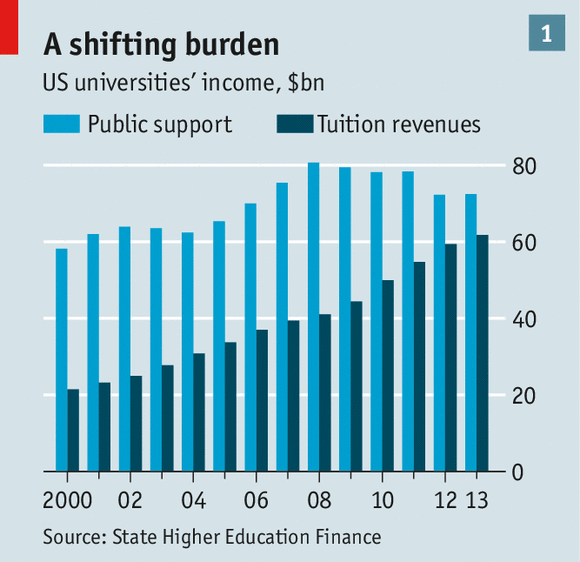
Tuition revenue more than doubled from 1987 to 2012. And here are the absolute numbers courtesy of the Economist:

But let's get more specific and look at costs, the state subsidy and tuition at the University of Colorado where Campos and I are both professors. Here is some specific data for the University of Colorado:
Here are the details (from this post):
So over the 10 years the price of tuition went up by 293% -- inflation only increased 27%. This is a big increase, and certainly increases the burden on those who pay the tuition. However, over that same period the inflation-adjusted cost of delivering that education went down by 14%. How can this be? The simple answer is that the state has cut its subsidy per student by 60% (closer to 70% after inflation), transferring a large portion of the costs of an education from the state to the student. 

The University of Colorado became more efficient from 2001 to 2001 in that the overall cost-per-student of delivering an education dropped by about 15% per student. Maybe, as Campos alleges, there are more administrators with swanky salaries. Even so, the cost of delivery of an education went down. Perhaps that is not true at every university, 

Yet, at the same time, tuition -- as seen by the student and their family -- almost tripled.

Campos is likely correct that overall public money to higher education has increased over recent decades (certainly true if R&D spending is included). But that is utterly irrelevant to the question why the price of tuition has increased. Tuition is a cost born by the individual student, and is a function or more variables than just the overall spending on higher education.

The data show clearly, and I think irrefutably, that the pull-back in state subsidies for students attending public universities has led to an increase in the price of tuition. No doubt there are also market factors at play (e.g., the salaries of professors and administrators) and institutional factors (e.g., infrastructure, operations, and yes, the size of administrative budgets). But as the University of Colorado example shows, the overall cost can be reduced, yet tuition can go up dramatically.

So when Campos concludes that "the claim that tuition has risen because public funding for higher education has been cut.... flies in the case of facts," he is looking at the wrong facts in the wrong way.  The pull back in state funding is indeed a primary driver in the increased costs of tuition.